Brand guidelines
The AFI identity system: mark, lock-ups, badges, colour, type, layout, data, motion, voice and every file you need to apply it.
Solvency, proven every hour.
AFI verifies that tokenized real-world assets are backed, continuously, and proves it on-chain. The identity should feel like that: precise, calm and evidential. Numbers are the hero. Ornament is not.
Precise
Hairlines, tabular figures, exact alignment. Every element earns its place or is removed.
Calm
Deep, dark surfaces, a restrained palette, slow and purposeful motion. Nothing shouts.
Evidential
Show the proof, not the promise. Live data over illustration; illustration only when it explains.
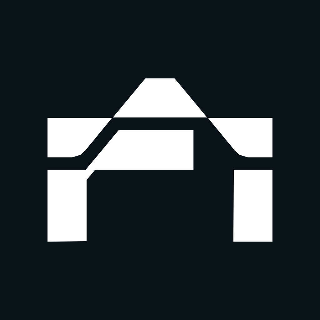
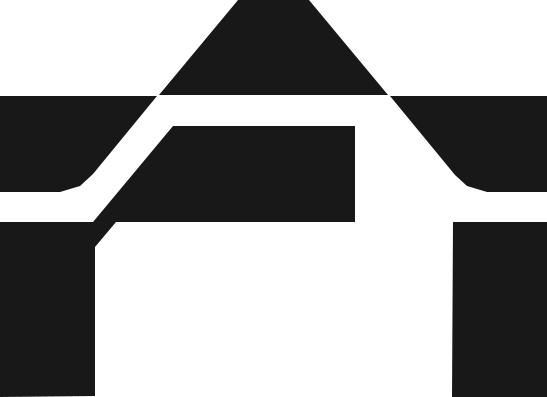
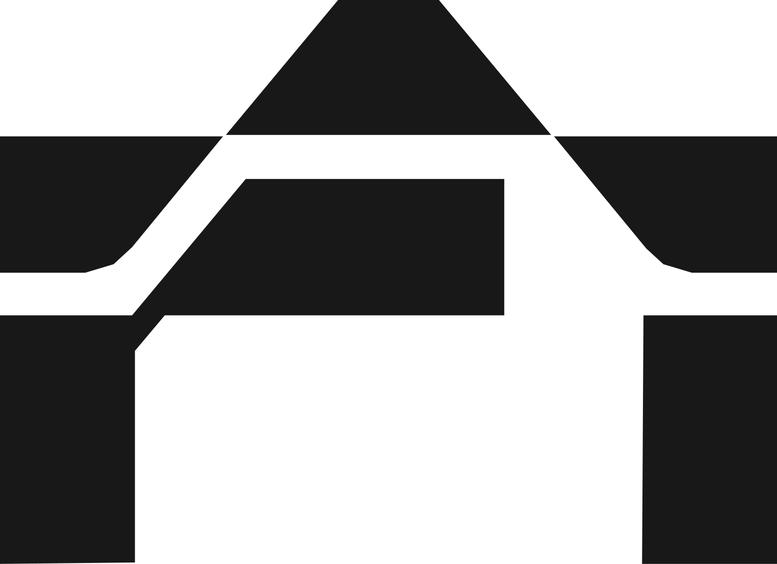
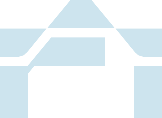
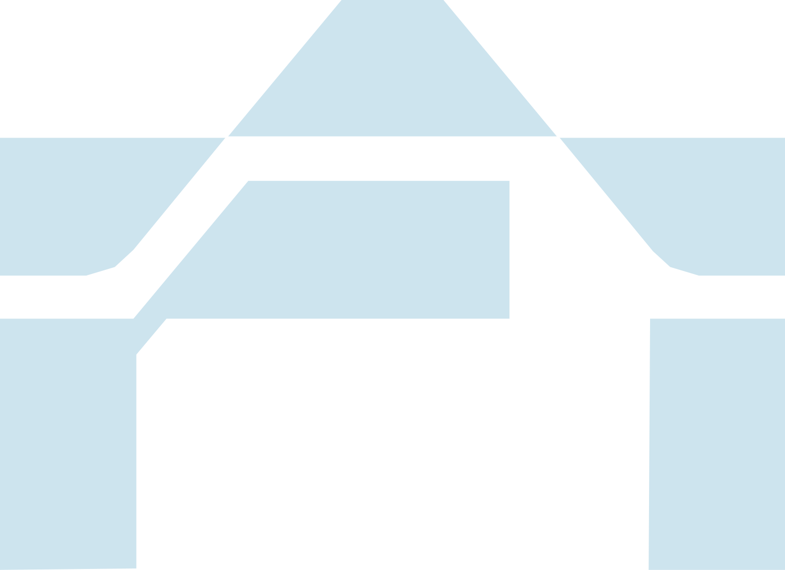
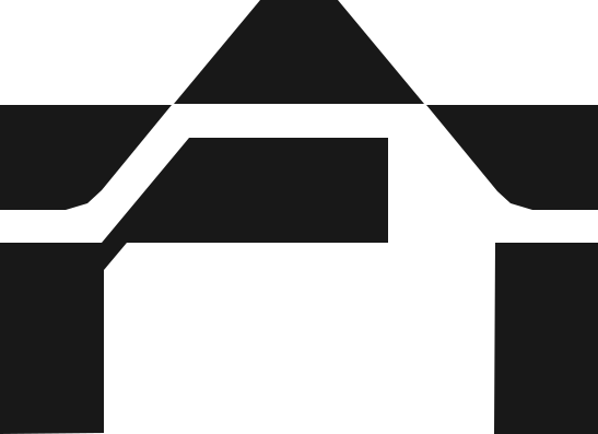
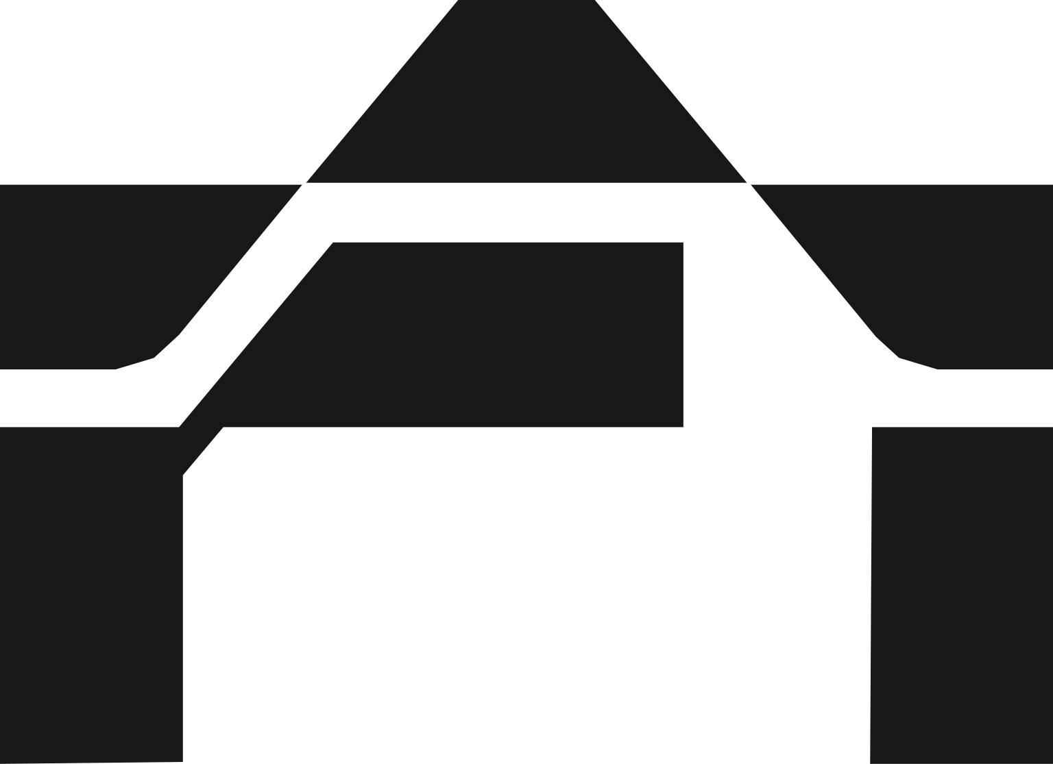
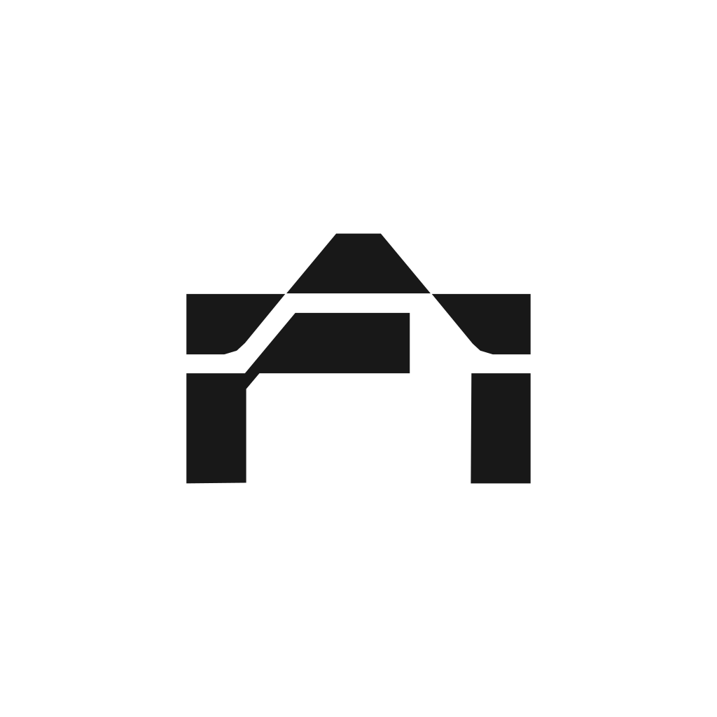
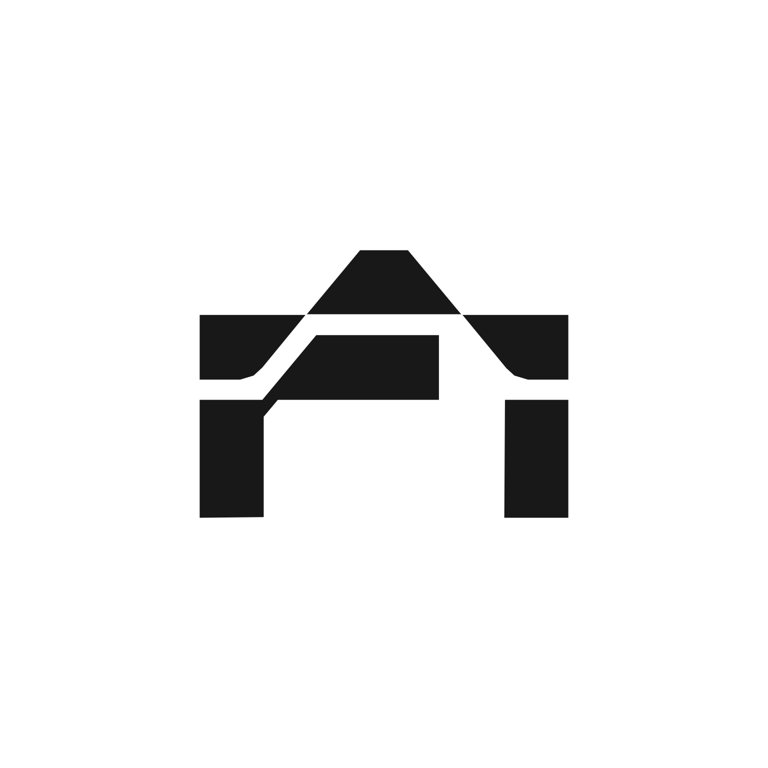
A vault door, head-on.
A lintel, two uprights and a gate, drawn in five solid shapes. The mark is the primary identifier and works from favicon to façade. Always use the supplied files; never redraw or trace it.
Construction
Built on a 547 × 397 unit grid. Gate opening = 0.5 × width. Upright width = 0.17 × width. Diagonals at 45°. No curves anywhere.
Colour rule
One flat colour from the palette per use. White on dark and Ink on light are primary; Teal and Sky are secondary; never two colours within the mark.
Preference order
1 · White on Night 2 · Ink on White 3 · White on Teal / Deep 4 · Teal or Sky on Night.
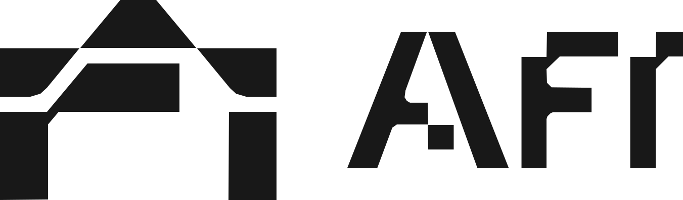
Mark with wordmark.
The horizontal lock-up is the default for headers, documents and signage. The stacked lock-up is for square and vertical spaces. The wordmark alone is permitted only where the mark already appears on the same surface.
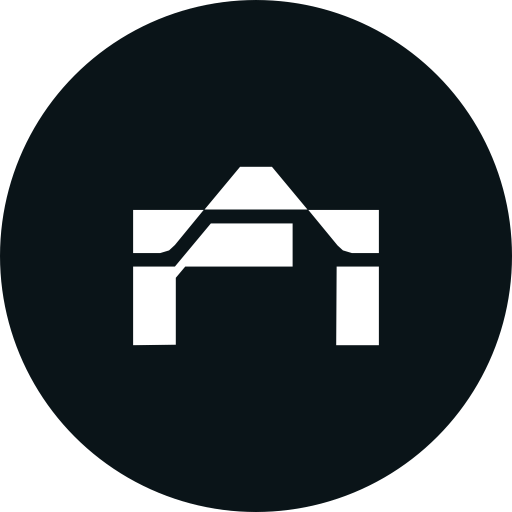
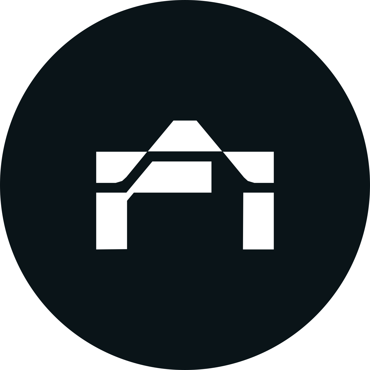
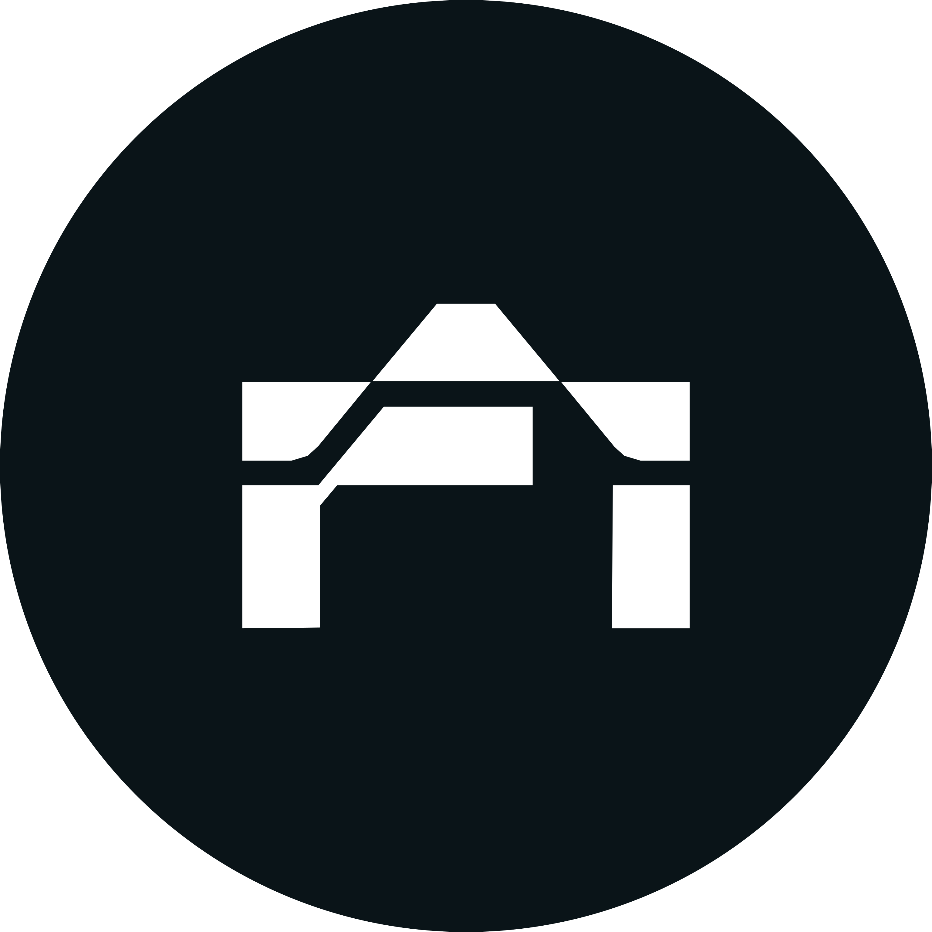
The mark in a circle.
For avatars, app icons, partner grids and anywhere a round container is required. The mark sits at 48% of the diameter, optically centred. Use the supplied badge files; do not build your own.
Avatar
Night badge, 1024 × 1024. Circle crop safe: the mark never touches the edge.
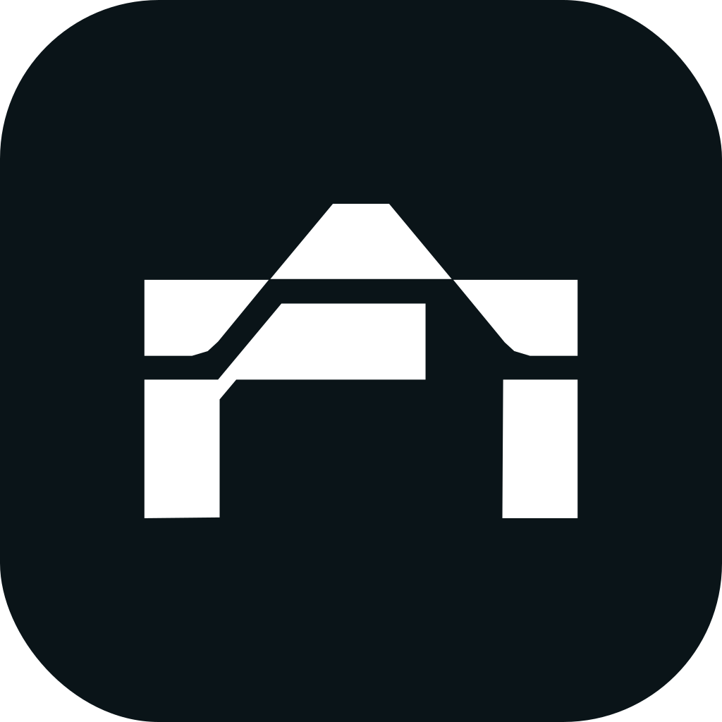
App icon
Night square with 22% corner radius, same mark scale. Supplied at 16–1024 px plus ICO and manifest.
In partner grids
Use the ringed Night badge so AFI holds its shape beside logos on white or coloured discs.
Room to breathe.
What not to do.
The mark is exact geometry. Each of these breaks it.
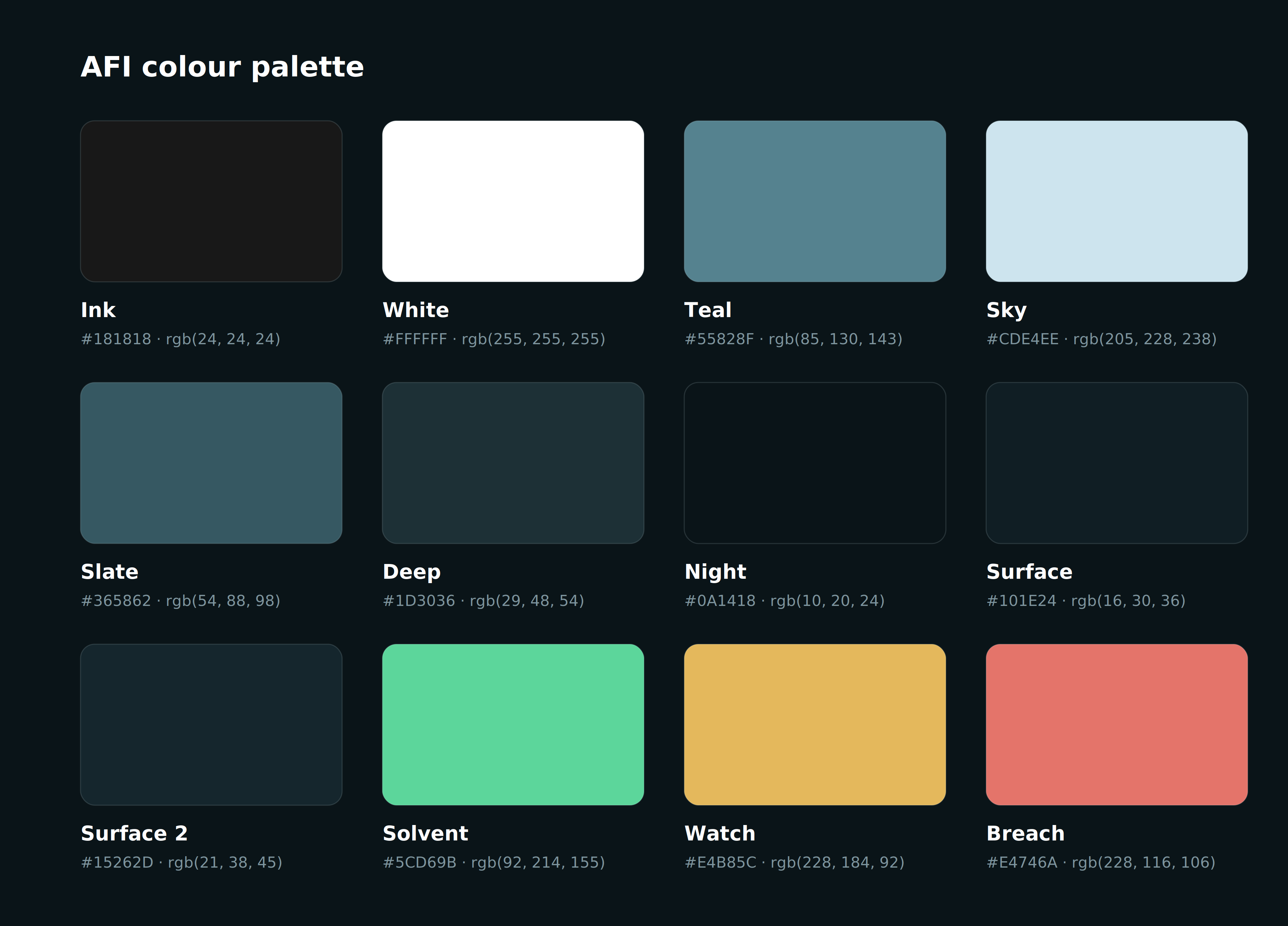
A dark, evidential palette.
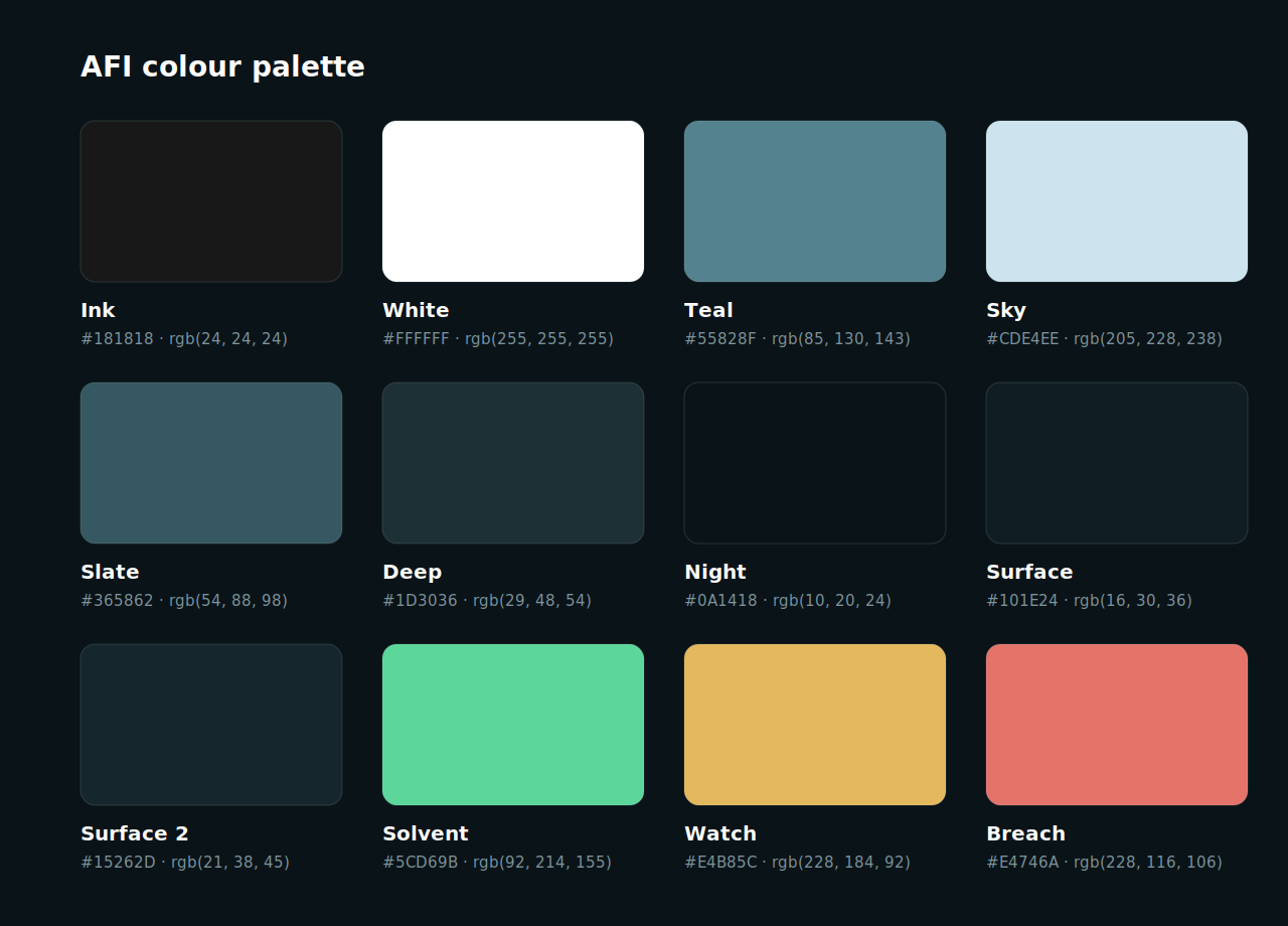
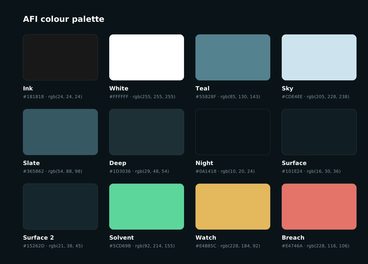
Night is the digital ground; Ink the print ground. Teal and Sky carry the brand. Three state colours each mean exactly one thing and are never decorative.
Proportion
Night and surfaces ~80% · text and hairlines ~15% · Teal/Sky accents ~4% · state colours ≤1%.
Gradients
Only two: Teal → Sky (bars, positive fills) and Slate → Deep (tiles, avatars). Always linear, 90° or 135°.
Ink #181818 replaces Night. Teal prints at CMYK 62 · 32 · 33 · 8; Sky at 18 · 4 · 4 · 0. Pantone 5483 C and 545 C are acceptable matches.
Public Sans, set tight.
One family, four weights. Display sizes are tracked tight; data is always tabular. Numbers are the most important thing we typeset and get the most care.
64 / 1.02 · 600 · −0.04em
44 / 1.08 · 600 · −0.03em
32 / 1.15 · 600 · −0.02em
20 / 1.25 · 600
16 / 1.55 · 400
13 / 1.5 · 400
11 / 1 · 600 · +0.08em · caps
600 · tabular lining
12–13 · hashes, addresses
Weights
400 body · 500 nav and small UI · 600 headings, labels, data · 700 only inside badges and pills.
Numerals
Always font-variant-numeric: tabular-nums lining-nums. Units follow the number with a thin space: 4.01×, $225M, 128.0%.
Fallbacks
Inter → Helvetica Neue → Arial. Public Sans is SIL-OFL; embed from Google Fonts or self-host the variable file.
A 12-column grid on an 8-point scale.
Content width 1200 px, 32 px side padding, 24 px gutters. Every spacing value is a multiple of 8. Sections are separated by 72 px of padding and a 1 px hairline.
Radii
8 px inputs and chips · 10 px buttons · 12 px inner tiles · 16 px cards · 20 px large panels · 999 px pills.
Cards
Surface fill, 1 px Sky-10% border, 20–24 px padding. Nested tiles use Night fill inside a Surface card, never the reverse.
Density
Marketing: 72 px sections, generous leading. Apps: 18–24 px card padding, 12–14 px table cells. Same tokens, tighter values.
The parts we reuse.
Buttons
Primary is white on dark. Secondary is a hairline outline. Never a filled Teal button.
Status
A pulsing dot means live. Status chips use the three state colours only.
KPI tile
Bar with floor
Teal→Sky fill for the measured value; a Watch-coloured marker for a cap or floor; Watch fill when the bar itself is liabilities.
Charts that read like a ledger.
Rings & gauges
Ratios only. Track at Sky-10%, arc in Sky or Solvent, 10–14 px stroke, rounded caps.
Heatmaps
Solvent at 55% for on-time proof windows; Watch for late; Breach for missed. Current window pulses.
Axes & labels
Text 3 at 10 px. Gridlines Sky-7%. No axis lines, no chart borders, no titles inside the plot.
Tooltips
Surface 2 fill, 1 px Sky-22% border, 8 px radius. Value in white 600, date in Text 3 below.
Slow, purposeful, live.
Motion exists to show that the proof is running. Curves draw in once; numbers count up on load and glide on update. Nothing bounces, nothing loops faster than four seconds.
Reveal
500–600 ms, 10 px rise + fade, on scroll into view. Stagger siblings by 60–100 ms.
Draw-in
Lines and arcs 1.2–1.6 s via stroke-dashoffset. Bars grow 1.0–1.2 s.
Live update
Numbers glide over 800 ms, then a 600 ms Sky flash on the changed value.
Easing
cubic-bezier(.2, .7, .2, 1) everywhere. Honour prefers-reduced-motion: show final states, no loops.
Say the number.
We write like a risk memo, not a launch tweet. Short sentences. Facts before adjectives. If a claim can be a figure, make it one.
Do
“Backed 4.01×, re-proven every hour.”
“Deposits pause below 1.20×. Withdrawals never do.”
“Verified assets ÷ liabilities.”
“Every $1 owed is backed by $4.01 of verified assets.”
Don't
“Revolutionary trust layer for the future of finance.”
“100% safe” — nothing is; say what the proof covers.
Exclamation marks, emoji, hype verbs, “unlock”, “supercharge”.
Name
AFI in running text. “Artificial Financial Intelligence” on first formal mention only. Never “A.F.I.”, “Afi” or “AFI Protocol” in headings.
Products
Verified Vaults · Verification Dashboard · Proof of Solvency. Capitalised as product names; lower-case when generic (“the proof”).
Boilerplate
AFI verifies the solvency of tokenized real-world assets every hour, proves it on-chain, and turns that proof into yield through ERC-4626 vaults on Ethereum, Base and Monad.
Beside other marks.
With issuers, networks and integrations, AFI appears as an equal: same visual height, separated by a hairline, on a neutral field.
“Verified by AFI” badge
Issuers may display the ringed badge with the text “Verified by AFI · Level 5” in Public Sans 600. Text sits right of the badge, cap-height aligned.
In others' materials
Supply the White-on-Night or Ink-on-White lock-up only. Never allow recolouring to a partner's palette.
Order
On AFI surfaces, AFI leads. On partner surfaces, follow their order but keep clear space and minimum size.
In use.




What's in the kit.
| Folder | Contents | Formats |
|---|---|---|
| logo/svg · logo/png | Mark, wordmark, horizontal and stacked lock-ups in White, Ink, Teal and Sky; on-dark and on-light versions | SVG · PNG @1× @2× @3× · transparent |
| logo/badges | Eight circular badges: Night, White, Teal, Sky, Deep, Night-ringed, Ink, White-Teal | SVG · PNG @1× @2× @3× |
| favicon | favicon.ico, icons 16–1024, app-icon.svg, site.webmanifest, head-snippet.html | ICO · PNG · SVG |
| social | OG image, X header, LinkedIn banner, square and circle avatars | SVG · PNG @1× @2× @3× |
| colors | colors.json, colors.css, colors.txt, figma-tokens.json, palette-sheet | JSON · CSS · TXT · SVG · PNG @3× |
| typography | Scale, tracking, numerals, embed code, fallbacks | Markdown |
| guidelines | This document | HTML · PDF |
afi-[element]-[colour]-[size].[ext], e.g. afi-lockup-horizontal-white-1024.png. Questions and new use cases: brand@afiprotocol.xyz